This Week
Research (4 hours)
User Research (1.5 hours)
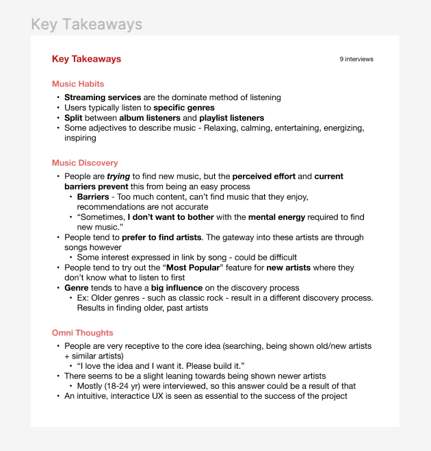
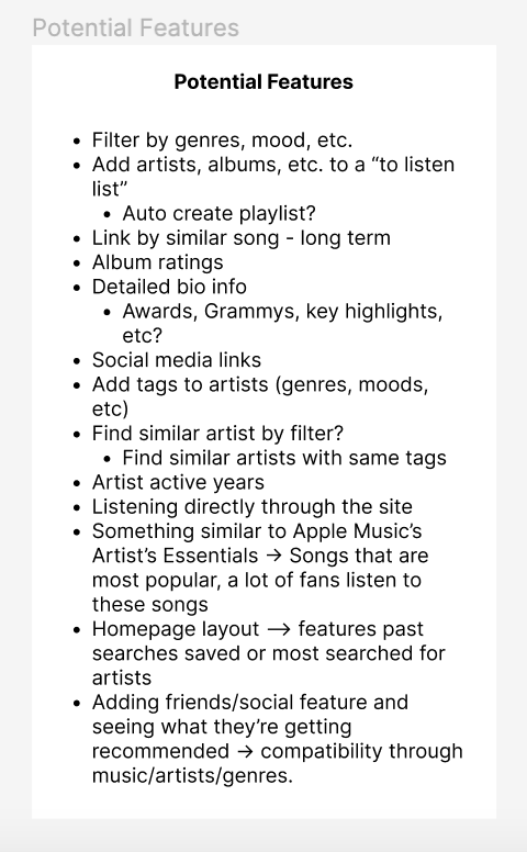
- This past week, I had three user interview sessions with college students, for about 15 to 20 minutes for each session. The first student is currently working as a DJ, another is a senior in the Music Industry major, and the last person who is a ‘regular’ student who enjoys listening to music. Our interview guide comprised of three sections: background, new music discovery, and Omni feedback. Our team had a combined total of 9 user interviews completed this week. In our team meeting, we analyzed the data collected from the interviews and organized our findings.


User Persona (0.5 hour)
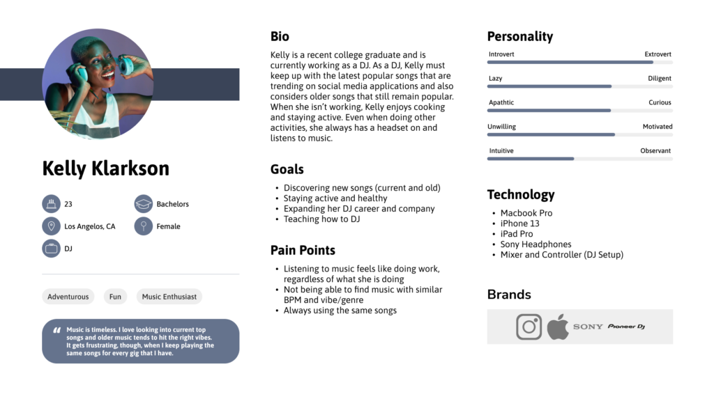
- With the findings from the user interviews, I began to explore and create the first user profile. Our team intends to create 2-3 total user profiles, which will be defined and finalized by our next team meeting.

Color & Font Exploration (2 hours)
- From our user interviews, we had our interviewees use adjectives to describe music. The adjectives included emotional, healing, relaxing/calming, entertaining, energizing, inspiring, exciting, meaningful, enjoyable, therapeutic, fun, and uplifting. With this in mind, I looked into different colors and fonts for Omni.
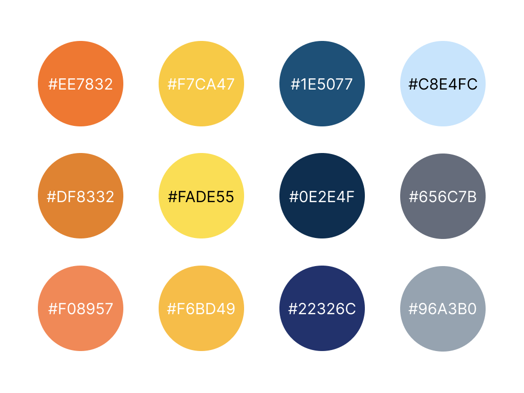
- Possible colors for Omni include blue, yellow, and orange. Blue represents relaxation, comfort, and and calmness. Yellow represents happiness, attention, and warmth. Orange represents energy, optimism, and fun. I also wanted to consider Spotify’s use of colors in the application. When a user goes into a playlist, the background color towards the top of the UI mimics the colors of the playlist background. This is done in gradient form, which led me to look into gradients as potential usage of colors for Omni. With gradients, it seems that its emphasis on certain elements allows for more visual depth. Users may find this to be more noticeable and a thought I had from this is to use gradient backgrounds for artist information pages. Gradient colors can either be from the artist profile picture, or colors based on color psychology. (https://xd.adobe.com/ideas/process/ui-design/what-is-color-theory/, https://uxplanet.org/gradients-in-ui-design-b97146f63df3, )
- As for fonts, I did initial research about different types of fonts and how the use of these fonts can help define a brand. Bold, angular fonts convey power and masculinity, whereas thin, rounded fonts convey softness, femininity. Because some of the adjectives we were given seem to be exude different, almost opposite feelings (for example, excitement/energizing and emotional/therapeutic/calming), I feel that in our next meeting, it would be helpful to go over font options with the team. (https://www.nickkolenda.com/font-psychology/)
Design (0.5 hours)
- Further color scheme exploration using https://coolors.co/ and organizing it in Figma.

Next Week
- User interviews with 3 more people
- Finalize user profiles
- Finalize color scheme and typography
- Start building basic style sheet
- Start journey map
Obstacles
- Scheduling/Timeline – Not getting tasks completed on time / postponing meetings will make it difficult to start/continue with succeeding tasks